Growing Urban
Growing Urban, written by Shannon McCarthy, surveys recent advances in urban agriculture in light of a growing global population. Using vector illustration and layout design, I created a visual identity for the article, helping to bring Shannon's words to life.
Timeframe: 1 month
Developing visual identity
Growing Urban touches on the many facets of agriculture and food access. The article begins with a discussion of technological feasibility, transitions to a discussion of the pressure for urban agriculture, and finishes with an examination of the impetus for this movement.
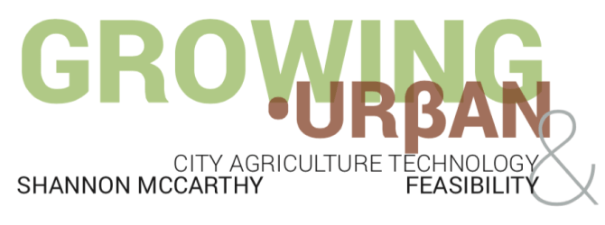
After reflecting on the article and discussing with Shannon, I began the design process by deciding on the color palette; different colors each have widely-accepted connotations. The article's core focus on growing food led me to consider a natural palette for the piece of green, brown, and a neutral slate. The colors in this primary palette are subdued and reflect the slow and steady rhythm of agriculture. The secondary palette incorporates bolder primary colors to enable some visual variety while maintaining this simple color foundation.


Designing illustrations in Illustrator
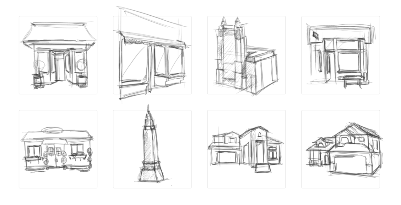
After the color scheme, I began sketching to capture the common thematic thread that would give the layout a consistency of form. This exercise began with a free-form exploration of all possible associations: fruits and vegetables, the agricultural supply chain, and places to buy food.
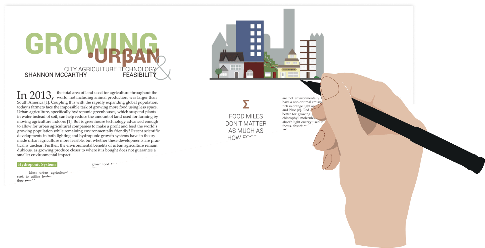
The article's heavy on place -- urban versus suburban versus rural -- led me to focus the illustrations on rendering stylized examples of the spectrum of human settlement patterns. Focusing on the built environment captures the breadth of impact of the topic and hints at the people who participate in every step of growing, shipping, purchasing, and consuming food.
Using the preliminary sketches as a base, I conducted a more thorough inventory of the architectural details that would suggest urban, suburban, or rural and compiled these visual cues into the stylized vector illustrations seen in the final layout.


Supporting elements and layout in InDesign
In addition to the color and illustrations, the article header and pull quotes are key visual cues in the design. For the article header, I used large sans-serif block letters rendered in the primary palette to mirror the visual rhythm of rows of green crops offset against strips of the brown earth when viewed from above. Use of the Greek letter beta in place of the "b" in "urban" is intended to hint at how Greek city-states relied on the agricultural output of the surrounding farmland.
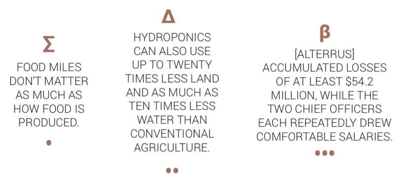
The pull quotes extend the visual and thematic decisions first made in the article header. The motif of using Greek letters continues. This time, the letters correspond to the overall gist of the accompanying pull quote. In the first pull quote, the capital sigma parallels the summing of miles needed to formulate this statistic. The dots underneath the pull quotes help the reader keep track of the quotes' order. The font used has a much lighter weight than the font of the header to reinforce the secondary nature of these pull quotes relative to the header.
The magazine this article was published in already had an established layout standard for body text and column configuration.
Growing Urban
Working with Shannon to craft a visual identity for this article allowed me to explore a systematic design process. From early open exploration to deciding on each component part of the visuals individually, I learned that design is about gradually narrowing the constraints in a solution space until reaching a well-defined solution: a cohesive visual identity for the final product.